LGCY ADMIN

Turning three disjointed portals into one streamlined, scalable platform employees actually enjoy using.

LGCY Admin

1 month
UX Research, UI Design, Prototyping
Sketch, Figma, Jira
View Prototype

Overview

Project Overview

LGCY Power’s internal teams relied on three separate admin portals to handle user management, company structure, and onboarding. Each system had different layouts, inconsistent branding, and bloated features that slowed down work.

The LGCY Admin redesign unified these tools into one streamlined platform, cutting complexity and improving efficiency for employees across the organization.

Problem

Before LGCY Admin:

  • Employees had to juggle three separate portals to complete everyday tasks
  • Portals were slow, visually inconsistent, and had individual logins
  • Pages were very lengthy, requiring excessive scrolling
  • Many fields and features were unused or redundant
  • Critical tasks like onboarding new users or managing org structure were confusing and time-consuming
Sample pages from the original 3 portals
The VERY lengthy Rep Details page (tilt your head)

Goals

The redesign aimed to:
Unify three portals into one system
Streamline workflows by eliminating unnecessary fields
Enhance usability for all employee roles
Strengthen branding with consistent UI

Research & Process

Initial Research

To understand pain points and opportunities, I conducted:

  • USER INTERVIEWS
    Gathered feedback from managers, recruiters, and operations staff to determine top priorities
  • SYSTEM AUDITS
    Identified overlaps and features that weren’t being used

Key Insights:

  • MAIN USERS IDENTIFIED
    Main users included:
    • Managers
    • Sales Reps
    • Accounting
    • Operations
    • Recruiters
  • FRUSTRATED USERS
    Lengthy, scroll-heavy pages caused frustration and stressed cognitive load on users
  • WASTED TIME/ERRORS
    Separate logins, as well as repetitive information across portals, wasted time and caused errors
  • LACKING OF HIERARCHY
    The company organization portal lacked hierarchy views, forcing users to dig into each entity to see connections
Highlighted in red are all outdated fields on the Rep Details page

Design Process

To tackle the challenge of centralizing multiple admin tools into one platform, I took a structured and iterative approach:

1. Understand Content

I made sure to understand user-specific flows, and learn what all of the fields/content are in order to group/display them correctly

2. Researched information-dense layouts

Since the admin system needed to surface large amounts of data without overwhelming users, I researched common approaches for high-volume interfaces. This led to the use of tab structures and wizard-style flows, making navigation easier while keeping tasks organized.

3. Leveraged existing framework

I chose to base the design on Metronic by Keenthemes, a framework that our developers have worked with previously. This decision reduced development time, ensured consistency, and gave us a solid design foundation to build on.

4. Built wireframes and interactive prototypes

I created low-fidelity and mid-fidelity wireframes, followed by clickable prototypes. These allowed me to quickly visualize workflows, test navigation patterns, and demonstrate functionality before investing in full UI design.

5. Validated with user groups

I tested the prototypes with different user groups, each representing a unique workflow within the company. This step confirmed that all necessary fields and pages were included, and highlighted areas of confusion or inefficiency.

6. Iterated through multiple revisions

Based on feedback, I refined the layouts, adjusted field groupings, and clarified navigation. Several rounds of iteration ensured that the final design aligned with user needs and streamlined their workflows.

Solutions

Through the steps listed above, the final LGCY Admin prototype addressed these challenges through:

Tabbed Layouts

Reorganized long detail pages into easy-to-navigate tabs, reducing scrolling and helping users find key info faster.

The redesigned Rep Details page, using a tabbed layout

Step-by-Step Wizards

Introduced guided workflows with progress indicators for tasks like onboarding new users, offices, or regions, making complex processes simple and intuitive.

The New Rep process, using a step-by-step wizard

Org Chart Visualization

Visualized relationships between offices, divisions, and regions, replacing the old system where connections were hidden and users had to dig into each entity.

The Org Chart screen, with collapsible relationships and selectable teams

Unified Portal with Room to Grow

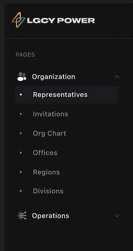
Instead of juggling three separate portals, we created a single system that brings all tools and workflows into one place. The platform is also flexible by design, making it easy for the team to add new features and pages as the company evolves.

The Org Chart screen, with collapsible relationships and selectable teams

Impact & Learnings

Final Impact

The redesigned Admin system led to:

  • Faster workflows for user management, onboarding, and structure updates
  • Reduced errors with simpler, more guided processes
  • Happier employees who no longer had to juggle three different portals and logins
  • Time saved for recruiters and managers during onboarding and invitations

Key Learnings

  • TABS REDUCE OVERLOAD:
    Splitting long forms into sections made tasks feel lighter and more approachable
  • PROGRESS INDICATORS MATTER:
    Users felt reassured and less overwhelmed when they knew where they were in a process
  • VISUALIZING COMPLEXITY HELPS:
    The org chart gave clarity to relationships that were once buried in tables
  • CONSISTENCY BUILDS TRUST:
    Aligning with brand identity made the system feel professional and reliable
  • SIMPLIFYING SAVES TIME:
    Centralizing systems saves time for users, freeing up time to do their job responsibilities.